|
| After a post it note thumbnail, this was scribbled up. |
In a nutshell: Was approached by friend Darren Koziol, DarkOZ publisher of 'Decay' and 'Retro Sci-Fi' Magazine, to to a short story. I'm flat out finding time to sleep lately with all the other commitments, so a cover was proposed. From a list, I chose to draw 'Space Amazons', as I have a thing about drawing trees for some strange reason. *Shrug*- and thought it would be a cool challenge. The Alien landscape elements sounded like a fun opportunity. I scribbled something up, and tried to utilise the trees as a circular framing device for the figures in the composition, and place the figures in a staggered "fan" formation, countering the lines of action and heights for a bit of variety in their placement in relation to one another. I dig perpendicular lines in compositions- something I've seen Kirby pull off, or shown in Disney books on avoiding parallel placement of limbs in a pose, so this was attempted with the spear placement, for instance. Well, that was the thought process, anyways.
 |
| Raw scan. Inking is not my jam, but I take the Steve Ditko approach of using inks to "draw" the detail in, that the loose wrireframe scribble is missing. Keeps the job "fresh" in my head, rather than feeling I'm re-drawing something I already drew. Ultimised blacks in the foreground to re-enforce the framing of the figures, so that I didn't loose them in the image. |
I'm not a Cheesecake artist, and frankly, that stuff doesn't interest me; A good drawing is a good drawing. In this instance, the subject matter and reference material suggested figures a bit too cheesecake for my comfort zone, and figured the Amazon component, coupled with the "John Carter of Mars/Sci-Fi fantasy/Red Sonja/Robert E Howard" vibes, should speak to female forms of more athletic frames, than buxom bikini types. So in this case, UFC/Women's Boxing and Olympian forms were referenced, at a poor man's attempt at what a Frank Frazetta drawing would look like if he drew like me (a monkey with a pencil taped to his paw, in comparison). If I can learn from a pose, I will.
 |
| Cleaned up scan, with pencils eradicated. The handy part about drawing in Prismacolour animation pencils (actually, mine had died by this point; I think this image was using cheap, kids colouring in pencils that came free with a marvel pencil case :P), is that Clean ups after scanning the image is super quick in photo shop. |
So this was the scanned image, with a black and white adjustment layer/filter applied to "knock out" the colours from the pencil roughs. Saves a heap of time (relative, without a Cintiq that is…*sigh*) in the clean up process, rather than deal with smudged/scribbly graphite that photoshop can confuse with ink lines when darkening/adjusting levels, contrast etc.
Re: inking- a discipline in itself, and something I continue to try and learn/challenge myself, particularly when I have the tools, time and courage to move beyond the cheap, store-bought calligraphy markers and art line pens. The smoke, for some reason I love trying to draw different sorts of clouds; the cross hatching with the thick to thin lines, is another poor man's attempt- in this case, Joe Kubert. The attempt is to at least give each element its own treatment- a Klaus Janson tip- so that the mud doesn't look like bark of a tree, the moss looks different to the bushes, the mist (it looks kinda Arthur Adams-ish, but I wouldn't point it out to him, it would be an insult) looks different to the heavy smoke clouds etc. I figured at least I could use colour to reinforce the difference.
 |
| If I recall, the colour scheme shifted during the course of this; Colouring for me is the ultimate fight; make this image work, or at least get as close to the vision I have in my brain not always the case- but the main idea was to simply select a main colour, and work in terms of complimenting the main colour, without overdoing the values, and still supporting the focal points. |
So this was essentially the colours, sans ink lines. Flats to renders and final flourishes etc. Always starting with a base gradient/colour, I wanted to further reinforce the alien landscape, and support the light/framing of the inks to tell the "story". An illustration can still convey a story, which is why I always promote th importance of understanding composition, and visual storytelling language regardless of the chosen medium; knowledge and practice of these elements always lift an image over a mere "drawing".
 |
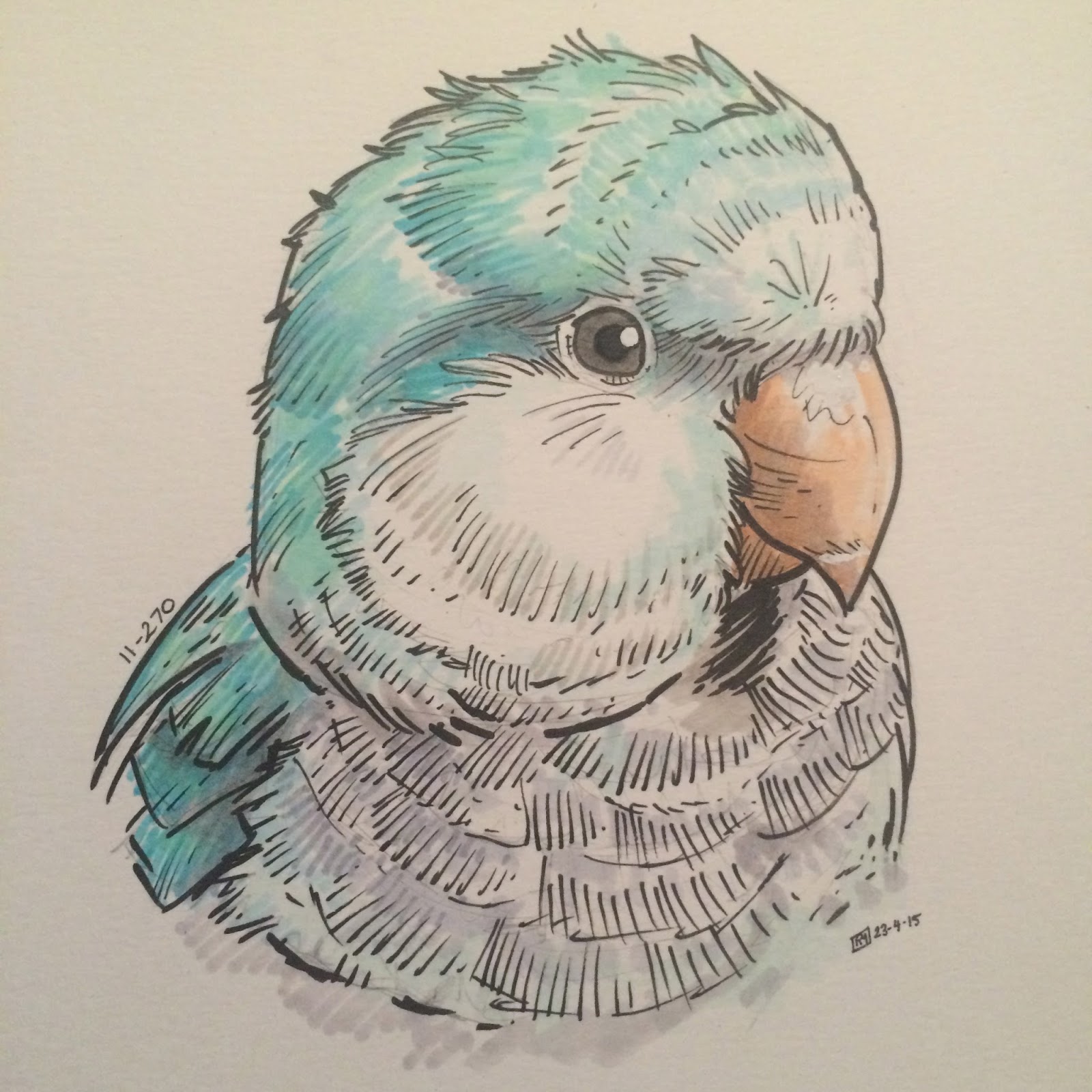
| I think the hardest part of the colouring was that damn Alien Parrot in the foreground... |
The Final image: A bit of a challenge to say the least, but at the moment, I don't hate it. That's a win, in my books. The problem with something like this is that the variety of colour elements run the potential of clashing if not handled subtly. Being able to utilise complementary colour-rim lighting, helped further separate the figures from the environment, without having them feel like their colour scheme clashes, or that they don't belong/feel part of the image. Some Colour holds and bits used to knock the edge off some of the parts in this pic, and given the number of these I got a chance to scribble a signature on, over the last weekend at Adelaide OZ Comic-Con (where the book was launched), I guess some people thought it was alright, so I'm content.
https://www.facebook.com/permalink.php?story_fbid=995150443855649&id=249103491793685